网页中使用的字体介绍

时间 : 14-11-20 栏目 : 产品设计 作者 : meiz@z3a105.com 评论 : 0 点击 : 719 次

serif 和 sans-serif

西方国家字母体系分为两类:serif以及sans serif。
serif是有衬线字体,意思是在字的笔画开始、结束的地方有额外的装饰,而且笔画的粗细会有所不同。相反的,sans serif就没有这些额外的装饰,而且笔画的粗细差不多。
serif字体容易识别,它强调了每个字母笔画的开始和结束,因此易读性比较高,sans serif则比较醒目。在走文阅读的情况下,适合适用serif字体进行排版,易于换行阅读的识别性,避免发生行间的阅读错误。
sans serif强调每一个字母,serif更强调于一个单词。
中文字体中的宋体就是一种最标准的serif字体,衬线的特征非常明显。字形结构也和手写的楷书一致。因此宋体一直被做为最适合的正文字体之一。不过由于强调横竖笔画的对比,在远处观看的时候横线就被弱化,导致识别性的下降
对于中文来说,宋体属于serif字体,而黑体、幼圆、雅黑则属于sans serif字体。
而英文,常用的serif字体为Times New Roman,常用的sans serif字体为Arial,Tahoma。

英文常见字体及介绍

Sans-serif

  1. Helvetica: 被评为设计师最爱的字体,Realist风格,简洁现代的线条,非常受到追捧。在Mac下面被认为是最佳的网页字体,在Windows下由于Hinting的原因显示很糟糕。
  2. Arial: Helvetica的「克隆」,和Helvetica非常像,细节上比如R和G有小小差别。如果字号太小,文字太多,看起来会有些累眼。Win和Mac显示都正常
  3. Lucida Family: Lucida Grande是Mac OS UI的标准字体,属于humanist风格,稍微活泼一点。Mac下的显示要比Win下好。
  4. Verdana: 专门为了屏显而设计的字体,humanist风格,在小字号下仍可以清楚显示,但是字体细节缺失严重,最好别做标题。
  5. Tahoma: 也是humanist风格,字体和Verdana有点像,但是略窄一些,counter略小,曾经是Windows的标准字体,Mac 10.5之后默认也有安装。
  6. Trebuchet MS: 为微软设计的一个humanist风格字体,个人觉得个性太过突出,用得不好会不搭。


Serif

  1. Georgia: 基本上适合正文屏显的衬线字体,非Georgia莫属了。笔画粗重,衬线明线,轮廓较大,小字体显示也很清晰,同时细节还算OK。
  2. Times: Times是为了报纸而设计的,特点是可以在有限的空间塞进去更多的文字,笔画较弱,小字号正文屏显看起来累眼。曾经Engadget改版的时候用了Times作为正文,被骂得很惨之后换成了Georgia。

1,  Arial

微软公司的网页核心字体之一,最常用的sans serif字体,当字号很小时不容易阅读。但是,大写的“I”和小写的“l”是无法区别的,你可以考虑用Tahoma字体来替代。
(苹果系统没有这种字体,但有一种对应于Arial的字体叫Helvetica,它是MAC机上与Arial 字体最相似的WEB字体,是别一种非衬线字体.它是一种性能优良的打印字体,但在屏幕上表现不是很好)

Arial

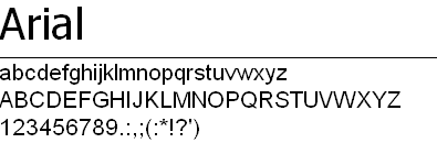
CSS写法:font-family: Arial, Helvetica, sans-serif;

2, Arial Black

ArialBlack

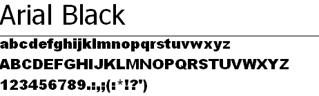
CSS写法:font-family: ‘Arial Black’, Gadget, sans-serif;

3, Arial Narrow

ArialNarrow

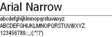
CSS写法:font-family: ‘Arial Narrow’, sans-serif;


4, Verdana

微软公司的网页核心字体之一,微软公司专门为屏幕显示而开发的。应用广泛。易于阅读。是显示器中最清晰的字体,即使字号很小,也很容易阅读。但字号最好介于10~14像素之间,超出这个范围就不好看了。

Verdana

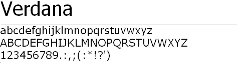
CSS写法:font-family: Verdana, Geneva, sans-serif;

5,  Georgia
微软公司的网页核心字体之一,可用性好。可读性比Times New Roman强。是网站设计中,浏览效果最好的serif字体,因为它是专为网上阅读设计的。)

Georgia

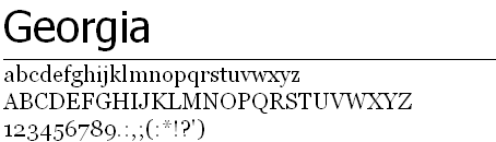
CSS写法:font-family: Georgia, serif;

6,  Times New Roman
微软公司的网页核心字体之一,可能是最常用的serif字体,是网站浏览器默认的字体,12pt以上的字体容易阅读,但小字号的字体易读性差。(苹果系统没有这个字体,有一个对应于Times New Roman的字体叫Times)

Times New Roman

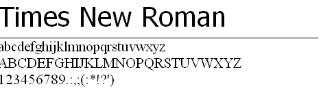
CSS写法:font-family: 'Times New Roman', Times, serif;

7, Trebuchet MS
微软公司的网页核心字体之一,与Arial相似,Trebuchet MS比Arial看起来优雅、古典一点。可以用来做标题,但小字号阅读起来会很困难(低于13PIX阅读起来就很累了,不太推荐用来做正文字体)。在苹果系统上也可以用Helvetica做替代。

Trebuchet MS

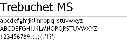
CSS写法:font-family: 'Trebuchet MS', Helvetica, sans-serif;


8 , Courier New
微软公司的网页核心字体之一,老式打印机字体,有一种独特的机械工整感觉。呈现计算机编码时,还会用到这种字体。12 pt的Courier New字体曾是美国国务院的公文标准字体,但于2004年1月停用,改使用14 pt的Times New Roman,因为其具“现代性”和“易读性”。

Courier New

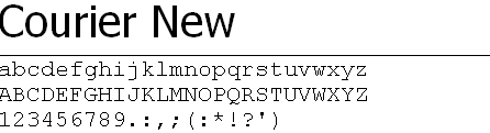
CSS写法:font-family: 'Courier New', Courier, monospace;

9,  Impact
微软公司的网页核心字体之一,Impact是1965年发表的一个无衬线字体,其特粗的笔画、紧缩的间距。半肥猫觉得:字体较为粗犷,适合使用在标题上,而不常用在内文。

Impact

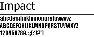
CSS写法:font-family: Impact, Charcoal, sans-serif;

10,  Comic Sans MS
微软公司的网页核心字体之一,手写体。这是一种争议很大的字体,讲实话,半肥猫也不喜欢这个字体,一点美感都没有,不过在一大堆规规矩矩的字体里面,有这么一个随意性比较的字体,可以变换一下口味,也算不错吧,建议不要用在正规的金融、政府、商业机构站点。

Comic Sans MS

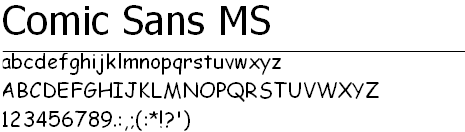
CSS写法:font-family: 'Comic Sans MS', cursive;

11,  Tahoma
Tahoma是一个十分常见的无衬线字体,Tahoma和Verdana师出同为名设计师马修·卡特的作品,由微软在1999年推出,被采用为Windows 2000、Windows XP、Windows Server 2003等系统的默认字型。半肥猫觉得:它的字体结构和Verdana很相似,其字符间距较小,用来作为标题,效果好过Arial(Tahoma的大写I 和小写l比Arial容易识别),但如果作为正文,他的字号不能小于13PIX,否则很多笔画粘连到一起,不利于阅读。

Tahoma

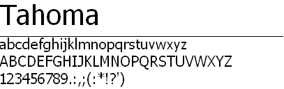
CSS写法:font-family: Tahoma, Geneva, sans-serif;

12,  Courier
Courier是一个等宽字体的粗衬线字体,主要是依据打字机所打印出来的字型来设计。原来Courier New的字体是IBM公司在1950年代设计给打印机使用的字体,后来这个字型成为整个打字机制造业的标准。Courier New是Courier的变体,比Courier更具机械味道。

Courier New

CSS写法:font-family: Courier, monospace;

13,  Lucida Sans Unicode
是一种OpenType型的无衬线字体 。1993年制作并随微软公司的Windows NT 3.1操作系统发布。有较大的x字高,具有很好的可读性,被广泛用于显示、出版等各种用途。
它支持Unicode2.0版本的基本字符,包括拉丁字母,希腊字母,西里尔字母,希伯来字母,以及国际音标字符。该字体是首个 Unicode代码的字体, 该字体从Windows 98开始一直作为系统预装字体发行。
后来发布的 Lucida Grande字体作为苹果公司Mac OS X系统的默认字体发布。
CSS写法:font-family: 'Lucida Sans Unicode', 'Lucida Grande', sans-serif;

14, Lucida Console
同Lucida Sans Unicode类似。

Lucida Console

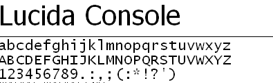
CSS写法:font-family: 'Lucida Console', Monaco, monospace;

15,  Garamond
Garamond(加拉蒙德)是一类西文衬线字体的总称,自16世纪40年代开始至今,有很多家公司和很多设计师参与到Garamond字体设计,如: Adobe Garamond, Monotype Garamond, Sioncini Garamond,和 Stempel Garamond等等。半肥猫觉得:字体给人端庄典雅,有些古典的感觉,在博物馆和历史性悠久的项目中使用,应该可以获得不错的效果。

Garamond

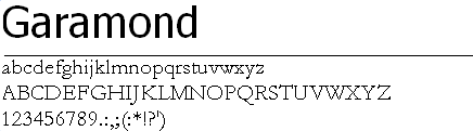
CSS写法:font-family: Garamond, serif;

16 ,  MS Sans Serif
微软系统自带字体。屏幕显示的像素字体。非衬线字体。

MS Sans Serif

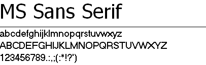
CSS写法:font-family: 'MS Sans Serif', Geneva, sans-serif;
17 ,  MS Serif
微软系统自带字体。屏幕显示的像素字体。衬线字体。
CSS写法:font-family: 'MS Serif', 'New York', sans-serif;

18, Palatino Linotype

Palatino Linotype

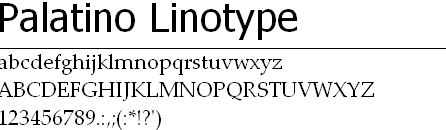
CSS写法:font-family: 'Palatino Linotype', 'Book Antiqua', Palatino, serif;

19, Symbol

Symbol

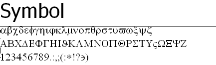
CSS写法:font-family: Symbol, sans-serif;

20, Bookman Old Style

Bookman Old Style

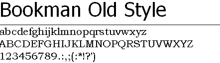
CSS写法:font-family: 'Bookman Old Style', serif;


中文常见字体及介绍

  1. 中易宋体:Win最常见的字体,小字体点阵,大字体TrueType,但是大字体并不好看,所以最好别做标题。
  2. 微软雅黑:Vista之后新引入的字体,打开Cleartype之后显示效果不错,不开Cleartype发虚。
  3. 华文细黑:Mac下的默认中文。
  4. Droid Sans和衍生的WenQuanYi Microhei:Andriod中的中文,也是Linux绝大多数发行版本的默认中文,,当然也有用WenQuanyi Zenhei的,不过比较少了。

早些年,windows中文操作系统几乎是清一色的“宋体”,几乎所有网站使用的都是“宋体”,自Vista系统出现以后,Vista和windows7默认都是微软雅黑字体。而XP系统的普及,使得宋体在桌面和互联网中多成为最常用的字体效果,近年来微软雅黑的字体虽然好看,但普及程度远远不及宋体

前端工程师在实现网站的时候,能够使用的中文字体局限于一下几种:
宋体、微软雅黑、Lucida Grande(苹果官方网站使用的中文字体)

一些建议

最好是使用大多数人的机器上可能有的常见的truetype字体。
Arial、Times Roman、Courier、Verdana和Century Gothic是常见的字体,中文里面Windows自带宋体、黑体及楷体。
如果你使用不常见的字体,不要忘记为没有此字体的浏览器指定替代的字体。
通过css设置font-family来制定字体集,浏览器可以顺序查找使用你制定的一系列字体,让你的页面看起来还不错。
・装饰性字体组好只用于标题。然后用css的font-family指定缺省字体。
・不要过分地使用字体,在同一页面中不要使用太多不同的字体。
通常使用两种字体就足够了:一种用于标题,一种由于文本。
某些字体组合常常无法工作。例如,不要再同一页面中使用script和斜体字体,不要在同一页面中使用一种以上的装饰性字体。
・尝试使用相同字型的不同浓淡度使页面更有趣。
如果你的页面相当乏味,没有图像,那么尝试设置促体的浓淡度(通过css的font-weight特性),这会使页面更生动。使用不用的浓淡度不仅可以使页面更吸引人,它还是组织信息的最有效的方法之一。
・不要在同一页面中放两种sans serif字体,除非你确实知道在做什么。
如果你要在同一页面中使用两种字体,它们应该来自两种不同的字型类别。
・不同的操作系统及浏览器中pt字会不一样大。
pt(磅)最早是用于印刷的字号,在windows和mac os里面,相同的pt值会对应不同的px(像素)值。唯一可靠的单位,就是px。
・设置字号的时候,要考虑好来你的网站的客人会是什么样的人?
如果你设置了固定的字号,比如12px,那么,对于普通浏览者来说,这是没什么问题的,但是如果你的网站的浏览者包括老人和视力有问题的人群,那么这个尺寸就太小了,最好提供个他们可以选择页面字体的权利。

Arial、Times Roman、Courier、Verdana和Century Gothic是常见的字体,中文里面Windows自带宋体、黑体及楷体。如果你使用不常见的字体,不要忘记为没有此字体的浏览器指定替代的字体。

通常内容应用的字体,font-family:宋体,微软雅黑,Arial,Verdana,arial,serif。通常标题应用的字体,font-family:font-family:宋体,微软雅黑,Arial,只是字号的大小不一样。通常的字体大小,font-size:12px或14px。让网页显示微软雅黑效果通常这样写CSS代码font-family:微软雅黑,宋体。这样网站首选微软雅黑,如果用户未安装微软雅黑字体,就默认显示宋体。

在新版本的CSS3,可以使用 @font-face 调用一些其他的字体库,弊端是,用户在访问的时候要去下载这个文件,所以会影响整个网站的效率。

结论的建议和一些实例

Arial,Helvetica,San-serif 这个组合适配性是最好的,也是最保险的.

font-family: arial,helvetica,sans-serif;

  • Google: font-family: arial,sans-serif;
  • Twitter:font: 13px/1.5 Helvetica Neue,Arial,Helvetica,’Liberation Sans’,FreeSans,sans-serif
  • 豆瓣:font: 12px/162% Arial,Helvetica,sans-serif;
  • 新浪微博:font-family: Arial,Helvetica,sans-serif;
  • Apple中国:font: 12px/18px “Lucida Grande”,”Lucida Sans Unicode”,Helvetica,Arial,Verdana,sans-serif;
  • 知乎: font: 13px/22px ‘Helvetica Neue’,Helvetica,Arial,Sans-serif;
  • Facebook: font-family: “lucida grande”,tahoma,verdana,arial,sans-serif;
  • Google+: font: 13px arial,sans-serif;

  • 微软中国: font-family: Segoe UI,Tahoma,Arial,Verdana,sans-serif;
  • 淘宝:font: 12px/1.5 tahoma,arial,宋体;
  • 百度:font: 12px arial;
  • QQ: font-family: “宋体”,”Arial Narrow”;
  • 新浪:font-family: “SimSun”,”Arial Narrow”;


工具

WhatFont

chrome 有提供一个扩展,可以查看网页的字体

https://chrome.google.com/webstore/search/whatfont

除非注明,文章均为( meiz@z3a105.com )原创,转载请保留链接: http://blog-old.z3a105.com/?p=272

网页中使用的字体介绍:等您坐沙发呢!

发表评论


       ==QQ:122320466==

 微信    QQ群


0

Aujourd’hui, une partie avec le développement du e-commerce, achats en ligne est devenu une partie de la vie pour beaucoup de gens. La mariage a commencé achats en ligne. Si vous choisissez achats les mariages en ligne, il peut être beaucoup moins cher que le salon de la Robe de mariée pas chermariée local, réduisant le budget de mariage. vous pouvez avoir beaucoup de choix si acheter de mariage en ligne. vous pouvez ramasser une robe de mariée bon marché sur Internet.
Piercing fascinerande figur, och nu tittar vi på 2016 senast brudklänning, kan du vara den vackraste bruden det!2016 senaste Bra brudklänning, söt temperament Bra design, romantiska spetsar blomma kjol, som du lägger till en elegant och charmig temperament.Kvinnan tillbaka mjuka linjer, människor brudklänningofta få en känsla av oändlig frestelse. Fall 2016 mässan, lämnar uppgifter om ditt bröllop charmig.
Yesterday afternoon, the Chinese team was training in the Guangzhou Gymnasium, when the reporter asked Zhao Yunlei the feeling of wearing the new cheap jersey , cheap jerseys online shopshe readily took a shirt from the bag crumpled ball to reporters, and she said with a smile: ” This shirt is light. ”Zhao Yunlei said: “Our material is very light like with the clothes of the tennis King Nadal, Federer, after the sweat, sweat does not drip down to the ground, when we do move, it is easy pace slipping if the sweat drip on the floor.”Tennis players Zhang Yawen, told reporters: “You might think the clothes attached to the body, fearing we swing will be affected, in fact, we do not feel anything, because the clothes are very light, very soft, put on quite comfortable. And it’s particularly good clothes to dry, washing and will dry in 15 minutes. ”
China’s sports enthusiasts NFL sweatshirt with mad love and the pursuit of, and therefore, NFL jerseys have a good market in China and development. China is a populous country, is the consumer, the economic momentum is so good, the sales prospects sportswear is immeasurable. With hot sales sweatshirt, but also to promote the importance of sports fans, on health, on the other hand is a matter of concern for the World Cup, fans wearing NFL jerseys and also can express themselves more fully love and obsession Therefore, NFL jerseys Wholesale jerseys online shopwholesale has good prospects and development in China.
ANTA-ANTA Sports Products Limited, referred to as ANTA Sports, Anta, is China’s leading sporting goods companies, mainly engaged in the design, development, manufacture and marketing of ANTA brand sporting goods, including sports footwear, apparel and accessories. Anta sweatshirt design advantages, warm stretch knit fabric, using Slim version of model, more personal fit, bid farewell to bloated, so wearing more stylish.GUIRENNIAO-This logo is a spiritual totem, smooth graphics implication unstoppable force; flexible deliver an elegant arc Wholesale jerseys china shop movement, strength and speed of the United States, a symbol of passion and rationality publicity “Heart” and “meaning”, “concept” unity; pass the fearless and enterprising mind, showing beyond the realm of self, to unstoppable force to create the future.XTEP-Xtep (China) Co., Ltd. is a comprehensive development wholesale jerseys china shop, production and marketing of Xtep brand (XTEP) sports shoes, clothing, bags, caps, balls, socks mainly large sporting goods industry enterprises.
There are a lot of fans in identifying the authenticity of the above cheap jerseys have great distress, so here to i will show you some methods to definitely affordable inexpensive cheap jerseys : Firstly, we should look at if it is working fine. China has been called the world’s factory, a lot cheap jerseys factories in China have foundries, but our cheap jerseys are all from here! Secondly, should to see whether it is the , we all know that it is difficult to get out of print once a genuine cheap cheap jerseys free shipping jersey was print. and we have all kind of stocka on the whole website, in other words, we have all you want ! Finally, look at the price, our price is not necessarily the lowest in the whole website but it must be most fair on the whole website, we certainly you will not regret later when you buy it. Of course, except that cheap jerseys, we also have the other products, such as socks, leggings and some other related products, everyone can enjoy the best services of here!

KUBET